Mercy Corps
Project Overview
Mercy Corps is a global relief organization that works to turn the crises of natural disaster, poverty and conflict into opportunities for progress.
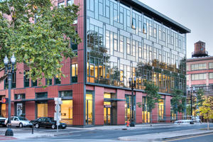
Their new headquarters is comprised of the restoration of a 42,000 sf neglected historical landmark in a challenging urban district and an addition of similar size. An egalitarian layout and environmental features actualize Mercy Corps’ mission to foster sustainable economic development through collaboration and self-empowerment while also helping to revitalize the neighborhood.
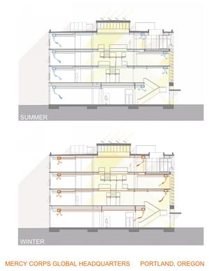
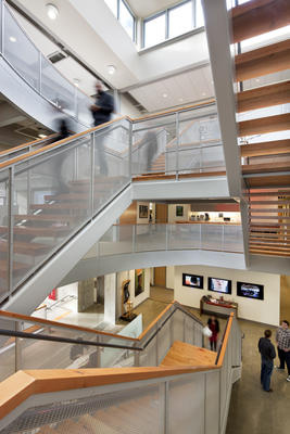
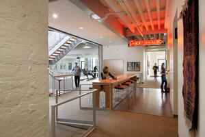
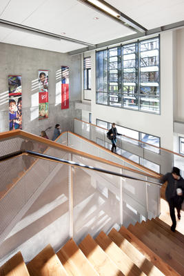
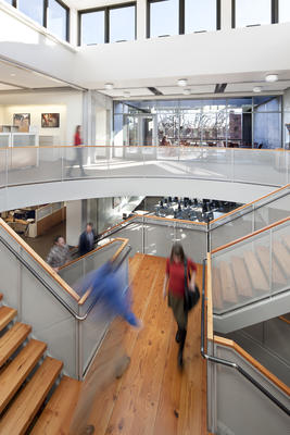
Beyond supporting more efficient operations, promoting effective collaboration within the organization was a fundamental design goal. A spacious atrium that doubles as an informal meeting area is defined by a light-filled stairwell that connects the building’s levels. This airy core also functions as a stack ventilator. Thus, efficient building performance and enhanced employee comfort are fully integrated.
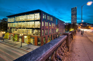
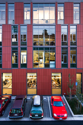
The addition’s exterior employs a weaving motif that both symbolizes its work approach and provides a harmonious complement to its historical counterpart. The headquarters also includes the Action Center – a window to the world – featuring interactive exhibits that educate visitors about the constantly changing nature of relief and development work and provide suggestions for concrete ways people can act now to help. Ground-floor community meeting facilities further extend the headquarters’ role within the community.
Design & Innovation
Mercy Corps’ facility is designed in a spirit that is consistent with the sensitivity, dynamism, and sustainable practices intrinsic to the organization.
Pursuing and achieving a high level of sustainability performance underscores Mercy Corps’ deep commitment to global environmental stewardship. Key to this was the restoration of a landmark, which not only led to the re-use of a building but also allowed for a much smaller addition (which was over an old parking lot).
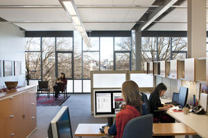
Efficient use of space and effective collaboration were other key design goals for the building. The 150 employees work in open spaces, which supports the organization's egalitarian nature, increases collaboration and fosters a greater understanding amongst staff. The open layout not only reduces square footage but also supports a familial culture and provides a greater range of work styles. Also, integrating efficient building systems and optimizing the use of space reduces the building’s footprint and systems.
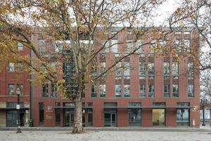
For the new addition, an exterior terra-cotta rainscreen system (its first use in Oregon) has a textile-like pattern, referencing cultural artifacts collected by Mercy Corps and complementing the scale and proportion of the adjacent facades. Its transparency and materiality provide a symbolic link between the organization and the community.
Regional/Community Design
Be the change, Mercy Corps’ motto, is emblematic of the organization’s culture. Mercy Corps helps people in the world’s toughest places turn the crises of natural disaster, poverty and conflict into opportunities for progress – providing communities with the tools and support they need to transform their own lives. When developing their new home, it was imperative that their global headquarters represent who they are. Key to this was designing a LEED Platinum building that provided users with a holistic understanding of their impact on the planet.
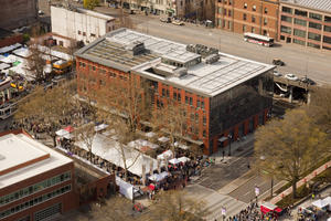
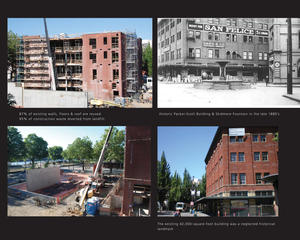
The urban location was specifically selected to promote alternative transportation. In fact, the secure bike parking now needs to be expanded! The global headquarters included a sensitive addition to, and re-use and renovation of, the historic landmark masonry Packer-Scott building. The major financial decision to save and rehabilitate the existing building both preserved the historic district and reused resources – a fundamental idea of sustainability and cultural regionalism. More than a renewed architectural presence in the neighborhood, the Mercy Corps Headquarters catalyzes the activities and values that are integral to its mission.
Finally, by using simple and smart systems that work with each other, the Mercy Corps Global Headquarters is a model for responsible design.
Metrics
Land Use & Site Ecology
The building redeveloped a major brownfield and infill site in the city, densifying and reinforcing the urban fabric while protecting adjacent environments, which include a significant urban park and weekend public market. Full cut off downlights for site lighting reduce light pollution, and the small parking lot to the north is paved with pervious pavement to encourage direct ground infiltration during rainfall.
The roof reduces heat-island effect using light-colored roofing combined with a 3,800 sf green roof, which not only filters water and slows stormwater discharge but also contributes to better air quality in this area of the downtown.
Landscape plants are xeriscaped to eliminate the need for irrigation water. These efforts resulted in a more than 50% reduction of potable water consumption for irrigation. In addition, potable water use was reduced by 40% by installing water-saving plumbing fixtures such as low-flow faucets and dual-flush toilets.
Bioclimatic Design
The building is oriented east-west, responding to the existing urban grid and allowing for smaller elevations on the east and west, which are difficult to shade. The building took advantage of the existing small openings on the west and southwest sides of the historic building to reduce exposure to the hot afternoon sun.
The long southern elevation is half existing historic punched windows and half new skin using similar glazing percentages. Large trees south of the building provide shade to the building during the warm summer months while allowing beneficial heat gain during the winters. The glazed east elevation permits natural light and beautiful views to the waterfront, while different window opacities limit solar gain.
Operable windows on all four sides allow the interior to benefit from natural light to virtually all work spaces and for the building to take advantage of the temperate climate and breezes channeled along the river. Sunshelves used above the storefront windows provide protection from summer sun and for pedestrians in this rainy climate. The main entry is marked with a glass wall in the middle of the south façade and is protected by glass louvers that automatically adjust based on outdoor temperature, providing shade when needed and maximizing energy performance.
Light & Air
Ample views and daylight reach virtually every work space and increase the indoor environmental quality for the occupants. The furniture is pulled off the windows and uses low, translucent end panels for equitable access to daylight through the space. Efficient lighting design and sensors work with the natural light to reduce overall lighting loads. Individual task lighting also reduces the need for ambient lighting.
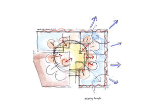
The mechanical system was designed to be simple, decreasing operation and maintenance costs while operating efficiently and in conjunction with other strategies to reduce overall energy use. The grand staircase at the heart of the building acts as a ventilation stack, drawing air in and up through a monitor-controlled clerestory. Combined with operable windows, this strategy reduces any need to cool the building by drawing cool summer breezes from the north side to the south side of the building and stair stack. During the winter months, however, the north side of the building benefits from passive solar heat gain.
Additional 30% outdoor air ventilation improves indoor air quality, and CO2 monitors activate and de-activate the mechanical ventilation system. If there is ample fresh air circulating through the building, the mechanical system automatically shuts down, reducing energy use.
Metrics
Water Cycle
Water conservation strategies on the Mercy Corps project focused on reduction of use combined with filtering and retaining stormwater on site.
Potable water use was reduced by 40% by installing water-saving plumbing fixtures, such as low-flow faucets and dual-flush toilets. Landscape plants are xeriscaped to eliminate the need for irrigation water, resulting in a more than 50% reduction of potable water consumption for irrigation. On-site paving is pervious to encourage direct ground infiltration during rainfall.
A 3,800 sf vegetated roof not only filters water and slows stormwater discharge but also contributes to better air quality in this area of the downtown and reduces the heat-island effect.
Metrics
Energy Flows & Energy Future
The energy use of a building is an important factor for reducing our carbon footprint and reaching the 2030 Challenge. Mercy Corps achieved all 10 LEED energy points and was predicted to achieve an Energy Use Index (EUI) of 43. An energy use survey done a year after occupancy revealed that the building outperformed our expectation with an EUI of 36. Energy-saving strategies included efficient envelope design, natural ventilation and operable windows used in conjunction with CO2 monitoring and lighting controls. The infrastructure is in place for a future solar array on the roof.
Energy analysis began early in the conceptual phases of the project. Decisions regarding envelope construction, window placement and operability, mechanical and electrical system types were driven with a carbon focus and interwoven with Mercy Corps’ values and vision. The project progressed through design with a focus on iteration and revisiting decisions to ensure the path chosen met the team’s ideals. The results produced a central core with a motorized roof monitor above to aid in the stack ventilation; mechanical ventilation dials back to allow for the natural systems to take over. The east curtainwall facade was tuned to promote passive heating and limit energy use.
Metrics
Materials & Construction
87% of the existing historic Packer-Scott building was re-used. Wood from the existing building was used in finish elements in the new addition in the main stair treads and the reception desk as well as at the coffee bars. During construction, 95% of the waste was diverted from the landfill through recycling or reuse.
Exterior materials were selected to be durable and low-maintenance, and all interior material selections focused on indoor air quality, renewable content and local availability. More than 10% of the new materials used were extracted, processed and manufactured regionally, and more than 20% have recycled content. The furniture selected for the building is highly flexible and adjustable to minimize future waste, and the systems were fabricated with high recycled content and with an eye on future recyclability.
Structural systems were left exposed and minimal finishes applied to save materials. The raw background is then offset by colorful artwork and artifacts collected from around the world, which inspired the building design, resulting in a simple yet rich environment.
Long Life, Loose Fit
Given the need for wise investment of nonprofit funds, all decisions for this project were made to promote long life and flexibility. Specifically, the reuse of the historic structure and skin lengthened the life of one building, and the materials used for the construction of the addition were deliberately durable and well-detailed to be long lasting, with minimal finishes that would require no maintenance or replacement. The project’s plan for future expansion to the north is a strategy to avoid major relocation in the future. Further, the exterior terra cotta rainscreen system can be disassembled and reused if the building is expanded to the north, or the tiles can be recycled.
On the interior, the large number of open office areas allows for flexibility for future changes. In addition, the furniture used a new “benching” system comprised of a spine with movable tables and files. This allows easy expansion and contraction of work stations or quick rearranging of teams for emergency response. Finally, the manufacturer, Herman Miller, has committed to sustainable practices in its factory and materials; they not only accept systems at the end of their life but also recycle most of the components.
Collective Wisdom & Feedback Loops
Integration of design and sustainability was very important to this project. Reflecting the organization’s mission, sustainable measures needed to respond to the “triple bottom line” of economy, society and environment.
The project was a collaborative effort between the design team, client and community. Regular meetings focused on sustainable opportunities and were held throughout the design process. In particular, the design development and construction documentation phase featured bi-weekly Integrated Design Workshops with the owner, design team and contractor, in which sustainable design concepts were advanced.
Energy analysis began early in the conceptual phases of the project. Decisions regarding envelope construction, window placement and operability, and mechanical and electrical systems were driven with a carbon focus and interwoven with Mercy Corps’ mission. The project progressed through design with a focus on iteration, revisiting decisions to ensure the path chosen met the team’s ideals.
Through extensive post-occupancy evaluations and client de-briefs, the design team learned several important lessons. In a naturally ventilated building, control of operable windows in the open office areas can be challenging. An automated system, though more expensive, would alleviate conflicts that sometimes arise between users. Also, domestic sources for terracotta panels have subsequently developed, which would have benefited this project.
Other Information
Mercy Corps did not want fundraising for the building to compete with fundraising for their critical humanitarian programs. It was important that the project be fiscally conservative and not extravagant, and therefore the ambition for sustainable design was to be cost effective. Recognizing the potential for Mercy Corps to be a leader and set an example for sustainable design, one donor asked what it would take for the project to become LEED Platinum. The design team worked directly with the development office to identify the strategies and related costs required to secure a special grant to make this happen.
While most of the environmental strategies employed by this project are simple and utilitarian, the building does showcase its sustainable soul at its entrance. The main entry occurs at the knuckle between the historic and new fabrics. A glass wall expresses this moment in the design, and its south-facing exposure offered a perfect canvas for the installation of a unique sunscreen over the building entrance. Inspired by an investment by the Lemelson Foundation, the glass is electrochromic; the sunscreen automatically adjusts based on outdoor temperature sensor readings to provide shade only when needed and to maximize the energy performance of the building.
During the design process, some notable and unexpected opportunities came up:
First, there were unique opportunities that came from reusing the existing building. The seismic upgrade to the historic structure was robust enough to lend support to the new addition, allowing for more open floor plans and exterior walls. This, in turn, supported the goals of the client. Reusing the existing building maintains historic fabric and culture at the same time that the more transparent addition reflects openness to the local community. Overall, this unexpectedly allowed synergies between the buildings, which reduced construction while enhancing the project.
Second, support from the Lemelson Foundation allowed the project to push its sustainable goals beyond what its own funding would have allowed, creating unique features, such as the electrochromic glass sunscreen, as well as encouraging the organization.
Third, the project’s proximity to the University of Oregon offered research and evaluation opportunities for them to use the building as a case study to measure building performance. Information from this research will help future projects as well as fine tune the systems in the building.
Finally, in the future, the photovoltaic system, which will soon be installed, will be used as a living laboratory by the University of Oregon. They will test the relationship between the solar panels and the green roof system with a hypothesis that potential symbiotic relationships between the two systems exist. Researchers predict that the PV panels will provide necessary shade to the sedum plant system, while the green roof reduces the ambient temperature of the roof environment. This, in turn, improves the performance of the panels. If proven, this research could potentially help more efficient sustainable strategies to be realized in the future.
Additional Images
Project Team and Contact Information
| Role on Team | First Name | Last Name | Company | Location |
|---|---|---|---|---|
| Principal in Charge/Project Manager | Will | Dann | THA Architecture | Portland, OR |
| Design Principal | Thomas | Hacker | THA Architecture | Portland, OR |
| Project Designer | David | Keltner | THA Architecture | Portland, OR |
| Project Architect | Laura | Klinger | THA Architecture | Portland, OR |
| Project Team | Mike | Meade | THA Architecture | Portland, OR |
| Project Team | Amie | Bates | THA Architecture | Portland, OR |
| Project Team | Jake | Freauff | THA Architecture | Portland, OR |
| Project Team | Steve | Simpson | THA Architecture | Portland, OR |
| Specifications | Alexander | Lungershausen | THA Architecture | Portland, OR |
| Quality Control | Charles | Dorn | THA Architecture | Portland, OR |
| Principal in Charge | Jim | Jerde | Architectural Cost Consultants | Portland, OR |
| Principal in Charge | Doug | Macy | Walker Macy | Portland, OR |
| Project Manager | Mauricio | Villarreal | Walker Macy | Portland, OR |
| Landscape Designer | Carolina | Aragon | Walker Macy | Portland, OR |
| Landscape Designer | Moyers | Michael | Walker Macy | Portland, OR |
| Principal in Charge | Randall | Toma | ABHT Structural Engineers | Portland, OR |
| Project Manager | Paul | Auerbach | ABHT Structural Engineers | Portland, OR |
| Principal in Charge | David | Malman | Architectural Lighting Design | San Francisco, CA |
| Acoustical Consultant | Greg | Coudriet | Sextant Group | Pittsburgh, PA |
| Principal in Charge | Sallee | Humphrey | DECA | Portland, OR |
| Senior Designer | Laura | Fix | DECA | Portland, OR |
| Designer | Mayumi | Nakazato | DECA | Portland, OR |
| Historic Consultant | Peter | Meijer | Peter Meijer Architect | Portland, OR |
| Principal Designer | Edwin | Schlossberg | ESI Design | New York, NY |
| Project Manager | Kris | Haberman | ESI Design | New York, NY |
| Senior Interaction Designer | Yuri | Sunahara | ESI Design | New York, NY |
| Interaction Designer | Dorey | Miller | ESI Design | New York, NY |
| Physical Designer | Curt | Meissner | ESI Design | New York, NY |
| Production Manager | Trip | Kyle | ESI Design | New York, NY |
| Senior Writer/Researcher | Clay | Gish | ESI Design | New York, NY |
| Graphic Designer | Lee | Berresford | ESI Design | New York, NY |
| Graphic Designer | Laura | Gunther | ESI Design | New York, NY |
| Principal in Charge | Don | Geddes | Walsh Construction | Portland, OR |
| Project Manager | Bhavna | Kumar | Walsh Construction | Portland, OR |
| Superintendent | Tom | Mitchell | Walsh Construction | Portland, OR |
| Assistant Superintendent | Richard | Stevenson | Walsh Construction | Portland, OR |
| Assistant Superintendent | Ben | Bechdolt | Walsh Construction | Portland, OR |
| Assistant Superintendent | Afton | Walsh | Walsh Construction | Portland, OR |
| Principal in Charge | Ralph | DiNola | Green Building Services | Portland, OR |
| Senior Consultant | Peter | Walker-Keleher | Green Building Services | Portland, OR |
| Mechanical Principal in Charge | Thomas | James | Glumac International | Portland, OR |
| Project Manager | Rob | Schnare | Glumac International | Portland, OR |
| Electrical Principal in Charge | Kirk | Davis | Glumac International | Portland, OR |
| Electrical Project Manager | Judi | Ebmeyer | Glumac International | Portland, OR |
| Chief Plumbing and Piping Engineer | Geoff | Winslow | Glumac International | Portland, OR |
| AV/Tel Data | Jim | Graham | Glumac International | Portland, OR |
| Energy Analyst | Mitch | Dec | Glumac International | Portland, OR |
| Principal in Charge | Carter | MacNichol | Shiels Obletz Johnsen | Portland, OR |
| Project Manager | Charles | Bahlman | Shiels Obletz Johnsen | Portland, OR |











I like the interaction with the community, the sharing of their parking lot, addressing site water in an urban setting. They have the community interaction on their off hours which is an important feature to recognize.
This was a building that was designed to be net zero ready. It wasn’t something, the energy portion but the designed the efficiency in for when they have the budget. And they designed system to be ready to receive PV panels when it is ready. Concentrated on reducing use and loads first.
Love the way it fits into the city. Took an existing building and renovated it and did a very beautiful contextual addition to it and stitched a city back together. It feels like they healed a scar on the site and they reconnected this portion of the city with the river. It just has the whole package.
75% of people arrive not in a car. Starting to feel like we are getting to a new model of quality of life where you don’t have to be stuck in a traffic jam and have giant parking lots surrounding your building – you can have a beautiful walk to work.
I really like that a non-profit client who has a global mission around social sustainability working with the architect to say that they can also participate and effect technological or environmental sustainability through their building. There were a lot of courageous moves.
Not to underestimate the obvious but let’s applaud the initial decision to do an adaptive reuse. The message is that it doesn’t cost more, in fact -- they absolutely optimized everything possible in the renovation with a solution that is reflective of the company’s culture.
It is incredibly contextual in terms of scale, in terms of material use, without replicating what was there.
The process was inclusive and integrated process and they worked jointly with the University of Oregon.