Livestrong Foundation
Project Overview
After 10 years of leasing space in a suburban office building, the Livestrong Foundation found its permanent home in the 1950s-era Gulf Coast Paper Co. (GPC) warehouse in East Austin, an underserved community in the process of revitalization.
The adaptive reuse of the GCP warehouse transformed the concrete tilt-wall building to provide office space, meeting rooms, multi-use facilities, an in-house gym, an open-air courtyard, and parking for the staff of 62. Ongoing plans call for adding a community-based cancer-support program to provide direct services, with an emphasis on uninsured and underinsured East Austin residents.
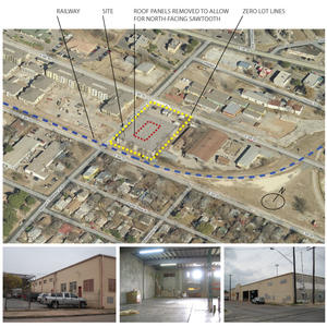
The building is situated on an inner-city, culturally diverse, and underserved neighborhood at the intersection of East 6th and Robert Martinez. The 30,000 ft2 "block" floor plate created challenges in providing the desired daylight and views for the foundation staff. This challenge was intensified as the building's zero-lot line relationship with the site's eastern boundary prevented the introduction of window openings. The south façade adjoins the freight railroad right-of-way, also used as a commuter rail and cyclist thoroughfare. Achieving LEED Gold certification, the project reflects the LiveStrong mission "to inspire and empower people affected by cancer."
Environmental Aspects
Innovation in Adaptive Reuse is the key to unlocking the potential for sustainable development in our neglected urban centers. The existing U.S. building stock currently exceeds 275 billion ft2 and offers an unprecedented opportunity for effective change. The design for the foundation breathes new life into both the building and neighborhood, and provides a model for sustainable urban renewal.
Key design strategies include:
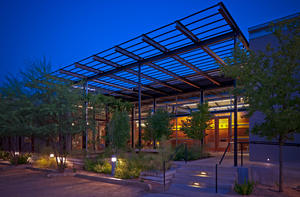
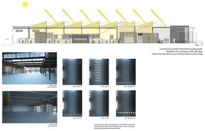
-Opening the facade and roof by use of extensive north-facing saw-tooth clerestories, flooding the rectangular box with indirect natural light and sky views.
-Recycling or reusing 88% of the materials from the demolition of the dilapidated warehouse.
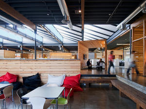
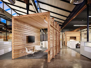
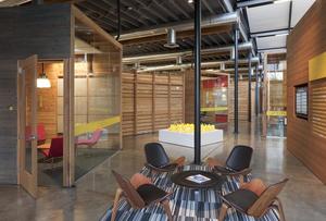
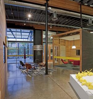
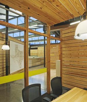
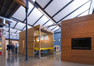
-Re-milling the salvaged roof decking to construct a variety of flexible-use enclosures or "crates," creating dynamic mixed-use working neighborhoods within the open office interior.
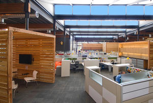
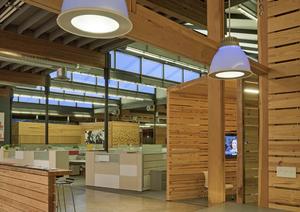
-Embracing the open office concept for everyone. Even the CEO shares common office and support space with the entire staff. Common support spaces ("crates") direct traffic flow, define departments, and create interactive work spaces that adapt to changing needs over time.
-Creating a place that contributes to its neighborhood and community.
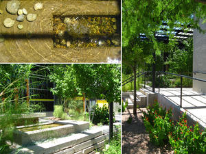
-Repurposing the removed concrete as retaining walls, fountains/garden elements, and walkways.
Owner & Occupancy
-Owned by Livestrong Foundation
-Typically occupied by 62 people, 40 hours per person per week; and 800 visitors per week, 2 hours per visitor per week
Design & Innovation
Innovation in Adaptive Reuse is the key to unlocking the potential for sustainable development in our neglected urban centers. The existing U.S. building stock currently exceeds 275 billion ft2 and offers an unprecedented opportunity for effective change. The design for the foundation breathes new life into both the building and neighborhood, and provides a model for sustainable urban renewal.
Key design strategies include:
-Opening the facade and roof by use of extensive north-facing saw-tooth clerestories, flooding the rectangular box with indirect natural light and sky views.
-Recycling or reusing 88% of the materials from the demolition of the dilapidated warehouse.
-Re-milling the salvaged roof decking to construct a variety of flexible-use enclosures or "crates," creating dynamic mixed-use working neighborhoods within the open office interior.
-Embracing the open office concept for everyone. Even the CEO shares common office and support space with the entire staff. Common support spaces ("crates") direct traffic flow, define departments, and create interactive work spaces that adapt to changing needs over time.
-Creating a place that contributes to its neighborhood and community.
Repurposing the removed concrete as retaining walls, fountains/garden elements, and walkways.
Regional/Community Design
Connectivity
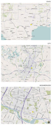
The site was selected to take advantage of existing and new multi-modal transportation in the heart of Austin, including pedestrian, bus, rail, and bike. Its southern boundary is defined by Austin’s new commuter rail and the Lance Armstrong Bikeway, a six-mile bike path that enables bicyclists to travel east and west through downtown.
Sense of Place
The site is surrounded by the older commercial urban streetscape typical of gritty East Austin, industrial rail, and a low-income 1920s era bungalow neighborhood. The integrated design team wanted to be careful not to “upstage” the neighborhood with a flashy re-development. Instead, a balance of open space, landscape, and welcoming entries fits the scale and context of the place. Graffiti art will soon adorn the façades as part of an invited effort to add richness, texture, and a touch of East Austin culture.
Public Space & Community Interaction
The Foundation’s largest meeting room is designed to be accessible independently through a small entry garden, and is made available daily to local community groups for meetings and functions. The small parking area is designed to accommodate a variety of public outdoor events.
Metrics
Land Use & Site Ecology
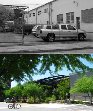
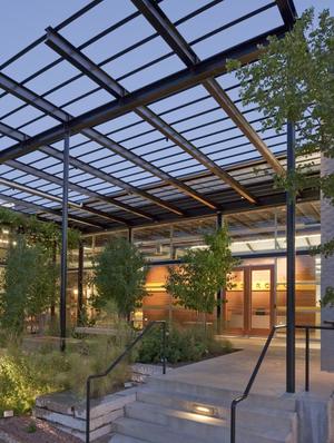
The old paper warehouse included a small, asphalt-covered parking area that was fenced in with eight-foot chain-link fencing and barbed wire immediately adjacent to the pedestrian walkways on the north and west sides. This area provided security for employee parking but also had a damaging effect on the character of the overall streetscape. The asphalt and fencing were removed. A new “front porch” entry courtyard was designed to join a new pervious parking area and native landscape between the street and the building.
Precast panels removed from the old building to create the new entry were reused to scale down and define the property while creating a welcoming relationship to the pedestrian streetscape. Native plants were used exclusively, and they provide shade, water, and urban habitat for birds, butterflies, and people.
The old truck loading dock on the western street frontage was transformed into an accessible multi-use space featuring visual connectivity and solar screening.
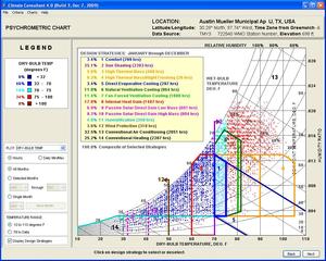
Bioclimatic Design
The existing warehouse’s footprint is 30,000 ft2 and orients with its longer axis along a north-south grid line. The old warehouse was nearly devoid of windows or other openings, other than a large, two-bay truck loading dock facing the western sun. Historic building requirements dictated maintenance of the existing western façade and prevented shading elements from being applied beyond the existing building envelope.
In response to these existing conditions, the design team re-oriented the building’s approach and solar access from the west towards the north and Sixth Street, allowing for access to diffuse north light. The existing loading dock was adapted into a side entry, incorporating a vine-covered buffer for handicapped access on the west-facing Robert Martinez (side-street) frontage. This solar buffering zone adjoins an internal multi-use space (former loading area), filters light, mitigates glare, and reduces heat gains from the low western sun during hot Texas afternoons.
An effective thermal envelope was established. Insulation was added to both the walls and the roof, and saw-toothed north-facing clerestory windows were added to harvest natural light while shielding the interior from the heat gains associated with the direct light of the harsh Texas sun.
Light & Air
Providing invigorating natural light to the interior was a major design focus for the team.
The existing warehouse footprint and solid concrete walls presented a particular challenge to creating a well lit interior. In order to allow for the most engaging open office environment, the team replaced the roof’s center bays with north-facing clerestory windows that harvest ample diffused daylight for the core workspace (providing up to 90fc at summer noon).
Low-glare northern sky views provide visual connectedness to the outdoors, interesting cloud watching, star gazing at night, and the vibrant environment desired by the hardworking staff.
-99.35% of the regularly occupied space is effectively day lit.
-97.30% of the regularly occupied space has access to views.
-Light sensors control artificial light and reduce energy consumption. Artificial lighting is rarely needed during the day. Desktop task lighting at each workspace supports efficient night-time use.
-A CO2 monitoring system provides feedback on ventilation performance.
-Outdoor ventilation rates are designed to exceed minimum requirements by 30%.
-No toxic chemicals are used in or around the building, in accordance with green housekeeping and landscape procedures adopted by the foundation.
Metrics
Water Cycle
In an urban context, the site area for landscaping is comparatively small. However, the design team sought to create pockets of green native plants that would provide much-needed shade and habitat as attractors for birds, butterflies, and people. As vines take hold, green screens and shade arbors provide cooling micro-climates at the building entry points. The design for the primary entry court provides a small water basin under the dappled shade of an arbor for wildlife, as well as a calming trickle.
Landscaping and irrigation systems are designed to reduce irrigation water consumption by 66.63%.
The project is designed to consume 53.8% less water indoors than a typical building of its size by employing high-efficiency faucets and showers, and both low-flow and reduced-flow toilets.
The existing asphalt-covered parking was removed to make way for pervious surface, tree-shaded parking, and reduced stormwater runoff and heat island effect.
Details and infrastructure are in place for seamless integration of Phase II plans for rainwater harvesting as funding sources become available.
Green Strategies
-Ecosystem Restoration
-Replant damaged sites with native vegetation
-Landscape Plantings
-Landscape with indigenous vegetation
-Landscape with plants that provide wildlife forage or habitat
-Plant trees to shade parked vehicles
-Low-Water-Use Fixtures
-Use low-flow toilets
-Demand for Irrigation
-Select plants for drought tolerance
-Alternatives to Chemical Treatment
-Use the least toxic treatment methods and materials for pest control around new buildings
Metrics
Energy Flows & Energy Future
Embodied Carbon and Energy. More than 80% of the existing warehouse structure was kept intact in adapting this structure for reuse. This represents an equal reduction in carbon impacts associated with manufacture, transportation, and installation of new materials. Significant embodied carbon reductions were realized through the careful reuse of demolished material and recycling of construction waste.
Operating Energy
The newly adapted facilities are designed to use 39.5% less operating energy than a comparable office building.
Lighting
Electric lighting loads are reduced significantly through the integration of effective daylighting. The design incorporates extensive north-facing saw-tooth clerestories, introducing diffused natural daylight into the open office space within the structure. This strategy virtually eliminates the need for artificial lighting during the daytime hours.
Controls
Automated lighting controls adjust light levels to daylight conditions. Highly efficient ambient lighting is designed to provide minimum light levels for evening hours, as workspace task lighting supplements light levels for 100% of the building occupants as needed.
Mechanical System
An ultra-high-efficiency variable-volume-refrigerant mini-split system provides a high degree of zonal control and energy efficiency. The system uses non-CFC refrigerants.
Energy Use Intensity
The project has an annual EUI, or energy use intensity, of 38.6 kBtu/ft2.
Metrics
Materials & Construction
Reduced material use. The foundation’s collaborative work style allowed the design team to configure an open, flexible space that greatly reduces the amount of material to be used, maintained, and adapted over time. Use of salvaged wood framing material for new support spaces eliminated the need to import new materials onto the site. These elements stand independently from the building’s structure and mechanical systems and may be repositioned or adapted for future uses as the foundation’s programmatic requirements demand.
Recycled/Reused Materials
-87.65% of the existing building shell materials demolished for the new facilities were reused on site.
-Salvage and reuse of pine from the roof structure for the “crates”
-Salvage and reuse of composite beams for benches and furnishings
-Salvage and reuse of the demolished concrete tilt-wall, which was re-cut and used as paving and landscape walls
Construction Waste
-66% of the construction waste was diverted from the landfill.
Local Materials
-28% of the remaining material came from within 500 miles.
Long Life, Loose Fit
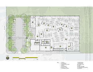
The foundation desired a 100% open office space. The core challenge was to design a space that accommodated differing work requirements while maintaining open office flexibility and “loose fit.” The open plan incorporates a variety of flexible-use common meeting spaces built using salvaged framing from the roof. Combined with special-use workrooms, these structures became the warehouse-inspired box “crates” that organize around a main circulation loop, presenting a front door relationship to the metaphorical “main street” dotted with open “park-like” break areas. This seeming ad-hoc arrangement mimics an urban landscape, defining a variety of interrelated neighborhoods of open work space. The combination of workspaces creates department areas according to programmatic needs and relationships to other departments. The “crate” structures are free-standing and operate independently of mechanical system and lighting infrastructure to allow flexibility of future adaptations and arrangements over time.
A simple trench chase cut into the existing slab provides access to power and cabling throughout to accommodate future adaptations.
A single kitchen and the adjacent “whole staff” multi-use space serve as the heart of the space, and ensure that folks from different departments’ paths cross daily as opposed to being self-contained within each department.
Collective Wisdom & Feedback Loops
The foundation implemented a post-occupancy thermal comfort survey of building occupants. In addition, the architectural team conducted a preliminary post-occupancy satisfaction survey to ascertain user satisfaction with the general building design. This was a non-scaled survey designed to allow all occupants to provide their own comments on the quality and effectiveness of the workplace, site facilities, and sustainability-related attributes of their own work environments. This feedback information was shared with all building occupants and helped the design team to evaluate effective strategies and identify building elements most valued by the users themselves.
A formalized, third-party post-occupancy evaluation in conjunction with the University of California, Berkeley’s Center for the Built Environment is currently being developed.
Other Information
The foundation was on a tight time frame for moving from its leased office space to the newly adapted location. The newly adapted facility needed to be designed, constructed, and ready for occupation within a 12-month period. This demanded a fully integrated process with the whole design and construction team. The team worked intensively together to keep close tabs on cost during the fast-track design process. This involved periodic cost analysis coinciding with design work, which resulted in a uniquely tailored fit between budget and design.
Every effort was made to ensure that every dollar was spent wisely in support of the foundation's mission "to inspire and empower people affected by cancer." The design team endeavored to also serve the foundation's mission by thorough, careful evaluation to ensure best value. The adapted building's final cost of construction was approximately $130/ft2.
Mechanical support systems can often account for a significant portion of construction cost when adapting an older structure to a new use. The design team began its early design process with a comparative cost analysis of four competitive mechanical systems, which included potential energy consumption and estimated cost/payback. Using this information, the list was narrowed to options that would provide energy savings combined with a system that fit the foundation's budget and intended use. The construction team furthered this investigation as the design proceeded to tighten the budget number, verify performance expectations, and troubleshoot any maintenance and operations concerns. The resulting system represented the best value selection as a result of this targeted process.
Predesign
The foundation went through a careful process in selecting the site of its new home. Several options were evaluated. The final selection was made in large part due to the foundation's desire to relocate into a currently underserved portion of the East Austin community, bringing new life and value to an area long neglected. An extensive feasibility analysis of the property was performed prior to purchase, ensuring that the existing structure was compatible with the intended use. This sped the process of early design work, as much was understood about the building from the start.
During this period, the owner team developed extensive space and intended-use analysis, which included input from staff and user groups. This formed the programmatic basis of the design.
The foundation developed a project focus team from a mix of staff, including facility maintenance, IT, and departmental staff, to represent the users' interests. Early visioning meetings were conducted with the design team to align goals and expectations.
Design
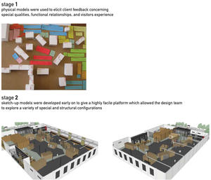
Once the existing building and land purchase had been finalized, the project leaders moved quickly to assemble an integrated design team capable of meeting the foundation's schedule, design, and sustainable building goals. This included the expertise of project managers, architects, engineers, LEED management consultants, commissioning agents, and construction partners. In response to the early visioning meetings with the owner's project focus group, the design team was able to begin developing concepts to meet the foundation's aspirations. Simple cardboard models were used to visualize the space, and programmatic use areas were set into place under a variety of differing configurations using small blocks and strips of colored paper. The staff representatives participated in moving these building blocks around to test various options. It became immediately apparent that differing departments within this open office facility could have entirely different needs, even when sharing immediate relationships between departments. Coupling this with the clear desire for a highly interactive, collaborative space without walls, the team realized that by carefully arranging the little blocks of support space, a "village" of flexible, interconnected spaces could be created within the shell of the warehouse. As a result, a design language naturally formed to explore ideas for shaping this village of distinct but interrelated department "neighborhoods" into the proper alignment, utilizing carefully arranged common-use support space areas and a "main street" circulation spine for staff and visitors alike.
The next big design challenge with the building related to the warehouse's ultra-deep floor plate. Seeking solutions, the design team evaluated a variety of daylighting strategies involving the roof plane. Utilizing daylight rendering tools, options were presented to the team, and the central north-facing sawtooth clerestory option represented the most balanced solution. Through the LEED documentation process, the design and construction teams were able to rigorously track the progress for many of the sustainability strategies being developed. This resulted in many benefits when assuring alignment with the construction to come.
Construction
This fast-track process saw elements of construction overlapping with design, thus requiring a high level of collaboration within the team. As partners in the process, this collaborative dialogue allowed the project to benefit from the wisdom held of the builder and crew. The construction team performed constant oversight to ensure that the job site was contaminant-free. When at one point a non-compliant VOC contaminant was discovered on the site, the construction team was quick to remove the material and correct the problem.
The construction team is responsible for the implementation of all the planned sustainability strategies. They were a key element in maintaining documented compliance with project goals.
Operations/Maintenance
The foundation has ensured that no toxic chemicals are used in or around the building by implementing green housekeeping procedures, landscape maintenance, and integrated pest management.
Commissioning
The commissioning process identified an energy consumption issue related to incorrect thermostat settings. The issue has been resolved, which has reduced energy operating costs considerably.
Additional Images
Project Team and Contact Information
| Role on Team | First Name | Last Name | Company | Location |
|---|---|---|---|---|
| Contractor | SpawMaxwell | TX | ||
| Lighting designer | Christina | Brown | ||
| Mechanical engineer | ACR Engineering | Austin, TX | ||
| Structural engineer | Architectural Engineers Collaborative | |||
| Civil engineer | Baker-Aicklen & Associates | TX | ||
| Commissioning agent | Brown Engineering | Meredith, NH | ||
| Environmental building consultant | Gail | Vittori | Center for Maximum Potential Building Systems | Austin, TX |
| Landscape architect | Christine | Ten Eyck | Ten Eyck Landscape Architects | |
| Interior designer | The Bommarito Group |


